Logo
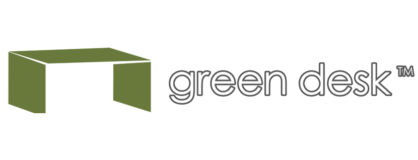
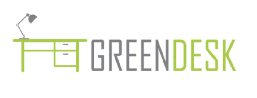
This project was all about redesigning the Greendesk brand. Greendesk is a family of co-working spaces spread throughout Brooklyn and queens promoting environmentally-friendly, affordable office spaces spread out in a co-working fashion. I was given a little bit of guidance, including the original logo and a newer logo they wanted me to use as inspiration.

Original Logo

Logo Example
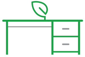
I took these two designs to heart and went to work on creating a new color. I chose different colors than the two logos I was given, going for a more rich vibrant green that made me think of fresh leaves, rather than the less saturated hues from before. The desk was an icon that they wanted to stay, so I worked on creating a slightly more simplified table, with a leaf to really hammer home the idea of being environmentally friendly. I kept the secondary color grey like in the two other logo designs, though I tried to make it a more similar gray in tone to the green, so as not to either over or under power the elements I added gray to.
Main Logo

Logo Icons


Typography
Heading // Bebas Neue
Aa
A b c d e f g h i j k l m n o p q r s t u v w x y z 1 2 3 4 5 6 7 8 9 0
Paragraph // Open Sans
Aa
A b c d e f g h i j k l m n o p q r s t u v w x y z 1 2 3 4 5 6 7 8 9 0
Color Palette
#1e9f39
#939598
Primary
#5e9bd1
#6cc393
#f4e795
Secondary
Icons
![]()
![]()
![]()
![]()
![]()
![]()
![]()
![]()
![]()
![]()
![]()
