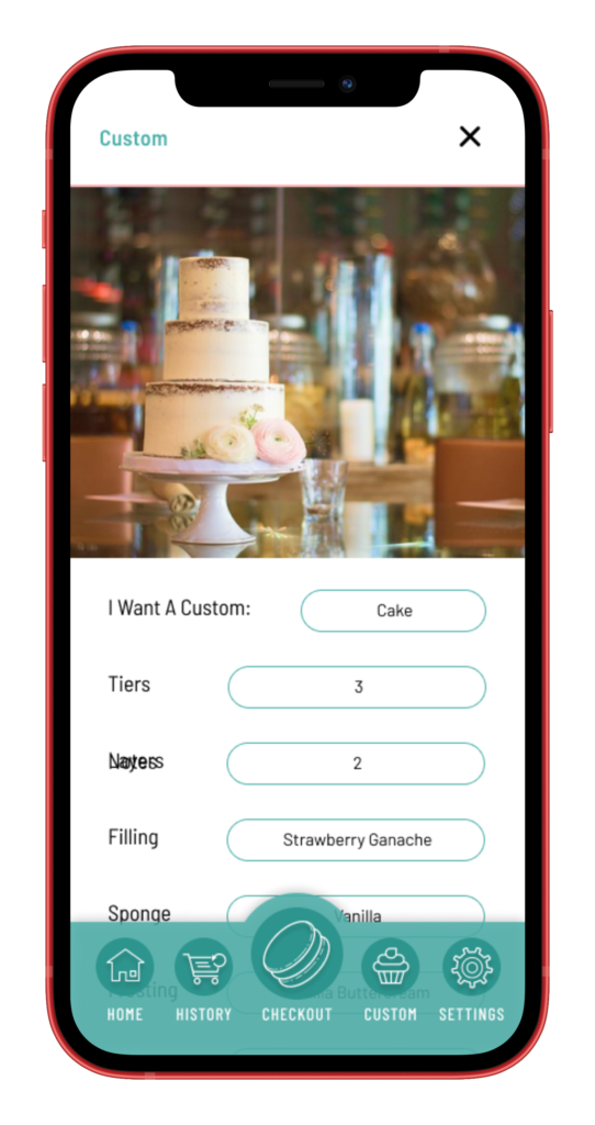
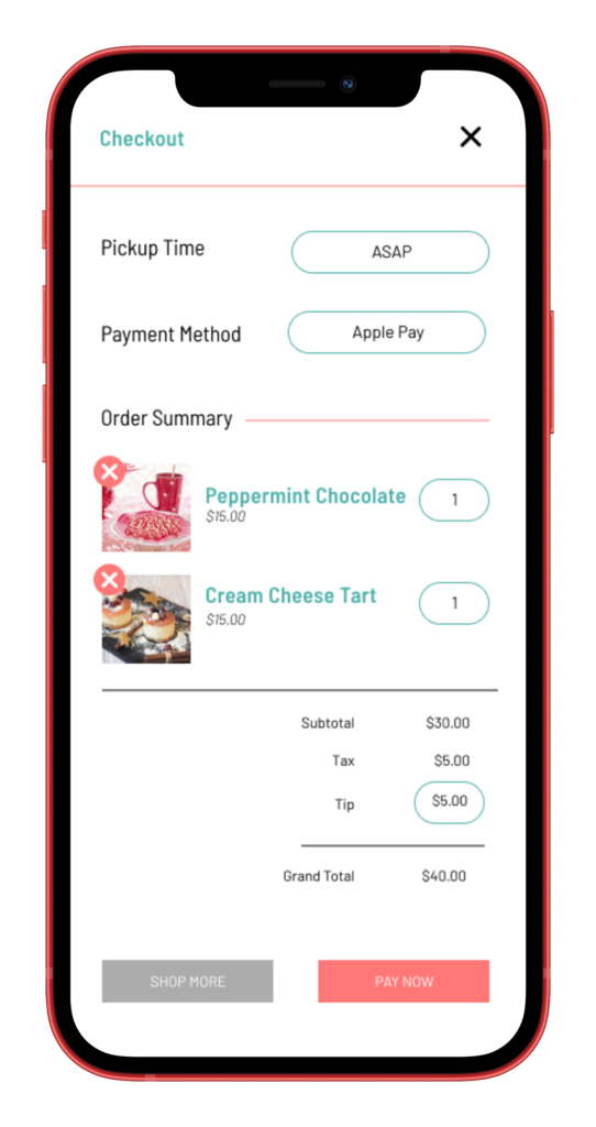
© 2021 — Rachael Cattel

The Project

The Product

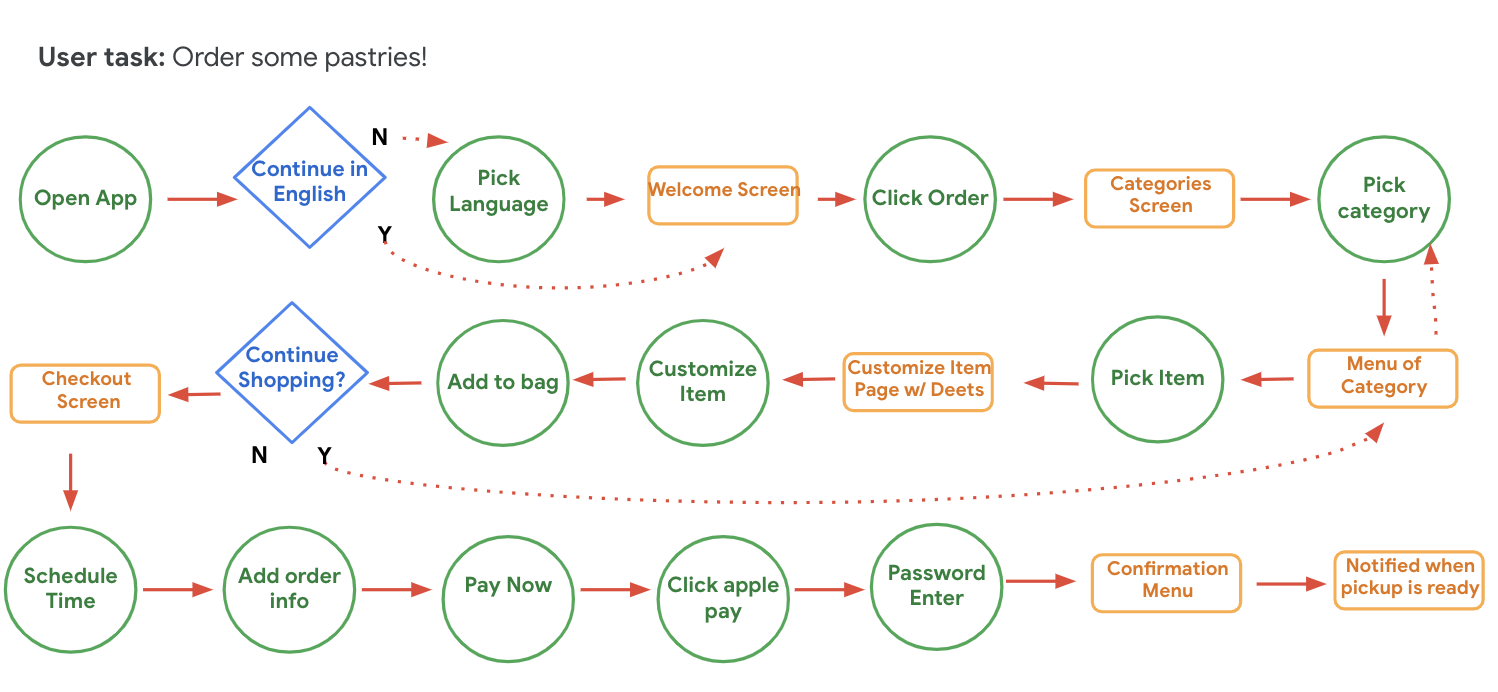
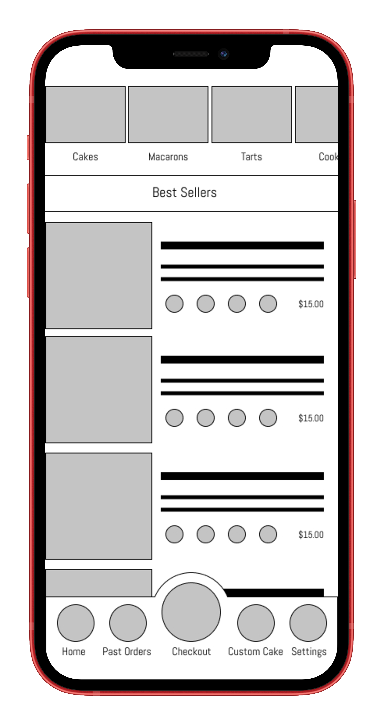
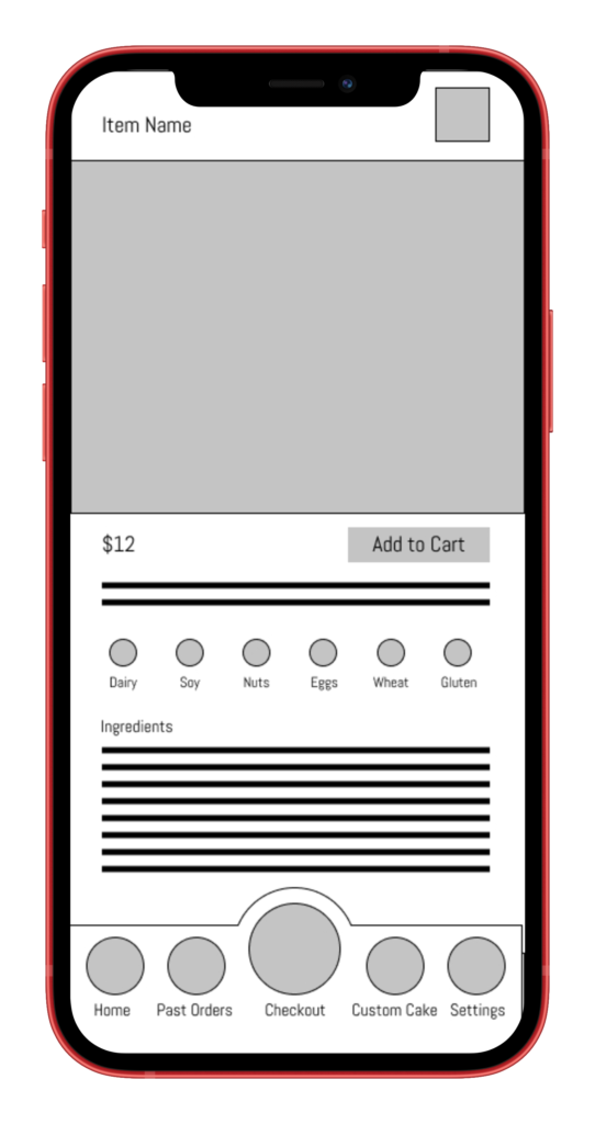
An app for the Bellerose Bakeshop, allowing users on a time crunch to order easily and efficiently without the need to speak to anyone.

Duration

April 2021 – June 2021

The Problem

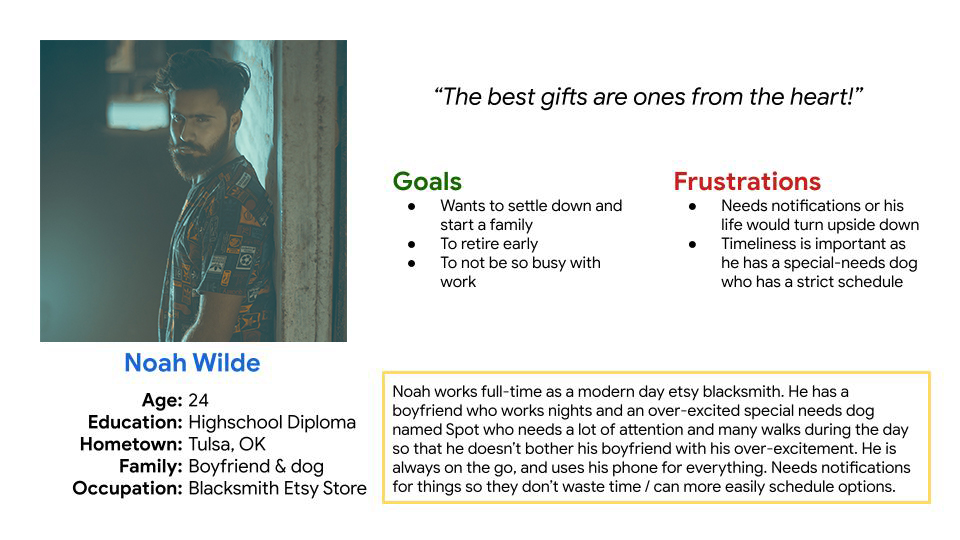
Users don’t have the time to wait in line during long lunch rushes, and would like to be able to order their items in advance and with notifications.They want to be able to order through an app without the need to interact with other people.

The Goals

  1. Allow users to save time by letting them place their order before they get to the shop.
  2. Streamline the ordering process so that users will have as little face-to-face interaction with bakery staff as possible.
  3. Create an easy-to-read menu that allows people to find what they are looking for as efficiently as possible.

My role

UX Designer in charge of user research, wireframes, prototyping, & design


Research

For this project, I began with interviewing a variety of individuals who order food fairly regularly, whether it be via app, phone call, online or in person. Out of these people, I found that the majority favored ordering through an app or online, whether that be because of time constraints, speaking difficulties or social anxiety.

The people that liked to order with an app tended to want to be able to get notifications with order updates or to be able to schedule their orders in advance. A lot of them complained about not having the time to wait around in a restaurant while their order was being made, especially during a lunch rush.

Another commonality between the people I interviewed was concern over dietary restrictions. Between special diets and allergies, many people are frustrated with how difficult it is to order food with their personal diets in mind.


Pain Points

1

Time

Time was by far the biggest pain-point when it came to ordering. Users do not want to waste time waiting around for their orders to be prepared. I will solve this pain point by adding in notifications and allowing for order scheduling.

2

Diet

Users may have dietary restrictions and it is not always easy to find allergen information in menus and apps. I will include a section for common allergens, as well as add an ingredient list for those with less common dietary restrictions.

3

Communication

Users who order food for pickup often have to communicate with staff to find their orders, and they do not always want or have the ability to do this. I will cut down on the amount of in-person communication by adding custom options in the app.


The Persona

Persona - Noah


The Journey

While I needed to add a lot of different parts to this app, between the amount of items on the menu and the information that needed to be conveyed, I also wanted to make this app as simple to use as possible, and make ordering items a breeze. The ability to skip steps was important to me, and the lack of forced interactions like having to sign-in or being forced to input personal information to use the app allows for a smoother ordering process and the ability to ‘window shop’ without consequence.

User Journey

Paper Wireframes

I wanted to make navigation as easily and effortless as I could, and to design it as such that people could not get lost in the app. As such, I tended to like the look of a bottom navigation bar that stayed consistent throughout the app. I also wanted to make big splash images so that the app could be used without too much in the way of language barriers.

Notebook Mockup


Digital Mockups

Cleaning up my designs, resulted in a more concise look but a general navigational system that I really liked. Another important aspect to me was making the app easy and quick to use, which is why I chose to have the home screen as the menu, with categories and allergens listed upfront. Making the checkout process as easy as possible allows users to be quick and efficient with their ordering.

Home Page Mockup

Product Page Mockup

Custom Page Mockup

Checkout Page Mockup

Usability Study

A moderated 20-minute remote usability study with 5 participants [3 men, 2 women who ordered food at least once a week]. The usability study had some common trends in the users pain points when experiencing my app:

1

Sizing

Some buttons were a bit small and thus more difficult to see and click.

2

Spacing

The fixed navigation menu was a bit cramped with the wording and hard to read.

3

Convenience

People want to be notified when their order is ready and choose their notification method.


High Fidelity Mockups

Designing icons, adding imagery and placeholder text, as well as smoothing out the checkout process and addressing the users’ pain points based on my usability study was all done to create these high fidelity mockups, as well as the high fidelity prototype below.

Home Page Mockup

Product Page Mockup

Custom Page Mockup

Checkout Page