Logos
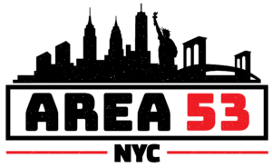
This was one of the more difficult logos I had to create. It needed to be graphic and punchy, to go with the ‘indoor sports’ vibe. I was given two additional requirements with this logo–texture and the NYC skyline.
Simplifying the city was perhaps the most difficult part of this logo. It needed to be graphic and simple enough to be visible at a smaller size, but distinct enough to be recognizable as New York City. I forewent accuracy in favor of simplicity and recognizable iconography. These buildings and landmarks aren’t actually that close together, but putting them all together makes a very recognizable icon that works both big and small.
Main Logo
Logotype
Typography
Heading // Rubik Mono One
Aa
A b c d e f g h i j k l m n o p q r s t u v w x y z 1 2 3 4 5 6 7 8 9 0
Sub-Heading // Raleway : 900
Aa
A b c d e f g h i j k l m n o p q r s t u v w x y z 1 2 3 4 5 6 7 8 9 0
Paragraph // Raleway : 600
Aa
A b c d e f g h i j k l m n o p q r s t u v w x y z 1 2 3 4 5 6 7 8 9 0
Logo-Font // Bungee
Aa
A b c d e f g h i j k l m n o p q r s t u v w x y z 1 2 3 4 5 6 7 8 9 0
Color Palette
#000000
#ed1f28
Primary
#8b0304
#f37021
#7d7d7d
Secondary
Icons

